A studio that focuses on the details, so that designs work intuitively and beautifully.
Agro
AGRO Power Jerky is the perfect way to get protein on the go. Their jerky is plant based and has less sodium than others. AGRO wanted an online storefront that helped them standout from the competition and carry their powerful brand and mascot, Jack Agro through the experience.
- Shopify Native
After investing a significant amount of time and effort into branding and packaging our product, we wanted to ensure that the strength of our brand was fully reflected on the website. Hyperlink took our packaging and core look and feel, and transformed it into a dynamic and powerful e-commerce experience. The entire process was highly collaborative, and we worked together until everything was perfect, from the spacing and sizing to the warehouse fulfillment setup.
Jordan Silbert
Dame
Working with Alright Studio, the Dame e-commerce site was built on Shopify with an extensive set of modules in order for Dame’s internal team to manage the site easily. Special attention was paid to interactions like subtle vibrations on link hovers and a glowing cursor that makes users feel warm and fuzzy. In addition to rebuilding the e-commerce piece of Dame’s online presence, the separate blog was folded into the rebuild for better SEO and a consistent look and feel.
- Shopify Native
Hyperlink was an integral part of our team, in bringing Dame’s updated web experience to market. The Hyperlink team painstakingly defined our approach to technology, then executed the build. Ultimately setting the client up with a fast, light, tight website and a super robust content management system!
Spencer Joynt
Ette
Ette’s e-commerce experience brings the brand’s feminine touches front and center for their rose petal infused vodka. Their existing visual assets are incorporated into custom design elements, such as animation and a hand-drawn font, honing the brand's visual identity.
- Shopify
- Gatsby JS
- Headless
We worked closely with Hyperlink to make sure every aspect of our brand came through the website for our launch. The website helped immediately put us on the playing field of the competitive beverage industry and we have total control to edit or add to the site internally.
David Rabinowitz
The Art Center
The new owners of The Art Center came to us wanting a dynamic and playful brand to embody the children’s art classes they offer. An animated logomark, logotype, and shape pattern were all designed and incorporated throughout their website. A custom enrollment system was built to meet their specific needs for both customers and the internal team.
- React
- Meteor JS
When we took ownership of The Art Center, we wanted to refine our brand and improve our web presence. Although we had been in the neighborhood for years, this rebrand represented a fresh start for us. The fun shapes and quirky animated logo helped us shift from feeling outdated to feeling like young and fresh. Our new online enrollment system also makes it easy for parents to enroll their kids in classes, eliminating our manual work in enrollment process. We are thrilled with our new look and website!
Melissa O'Neill
Ray
Bringing an artful feeling to real estate, the Ray Philly website uses subtle paper textures. Fun, interactive touches like a 3D animated button play off the brand’s 3D logomark and showcase the apartments and amenities that Ray offers.
- Next JS
Airsign
Collaborating with High Tide, we brought the bold brand of Airsign to the web to tell the story of the beautifully designed HEPA Vacuum. The mechanics and features of the vacuum are presented in an exploded view through a scroll-based animation. The Headless Shopify build includes a subscription integration for accessories.
- Shopify
- Next JS
- Headless
We were halfway through the project when we reached out to Hyperlink for help with the web portion, which had gone off-brand. They quickly translated the modern look and feel we had designed for Airsign to align with our brand guide. Hyperlink was an integral part of the project and developed the site so that the client can make changes on their own.
Danny Miller
Noom
Noom’s brand hub showcases their extensive brand assets and voice guidelines. Our development work brought Alright Studio's design to life, using scroll-based Lottie animations and slick page transitions.
- Sanity
- Lottie

Milton
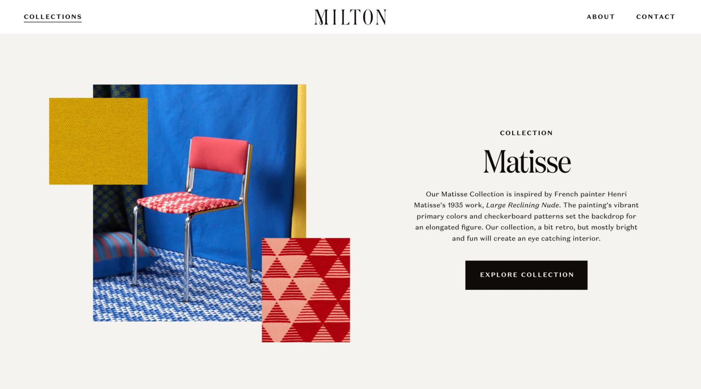
Being a new company in the luxury textile space, Milton needed the full package of services to launch their company. The company's artistic and historical spirit was channeled into a refined and exuberant visual identity, built from the ground up. The elegant wordmark and textile collages give the brand a strong presence and solidifies the website, giving users an immersive experience.
- Shopify
- React
- Headless
Since launching my business working with Hyperlink, they designed all of our branding and designed and built our website. In addition to being our main web partner they designed all of our print collateral. They are easy to work with and bring great ideas to the table. Customers regularly compliment our website and tell us it makes us feel like a company that has been around for years! Their work gave us a product that is unique and reflective of our values and ethos.
Vera Neykov
Monopolio
A company that honors tradition and history, we worked with Monopolio’s founder to pull pieces from the company’s archives and research to capitalize on the brand's rich history. Illustrative elements were pieced together to create modern parallax effects while historical photography was given the same hue to separate the old and the new of the 1882 cerveza.
- Gatsby JS

YONY
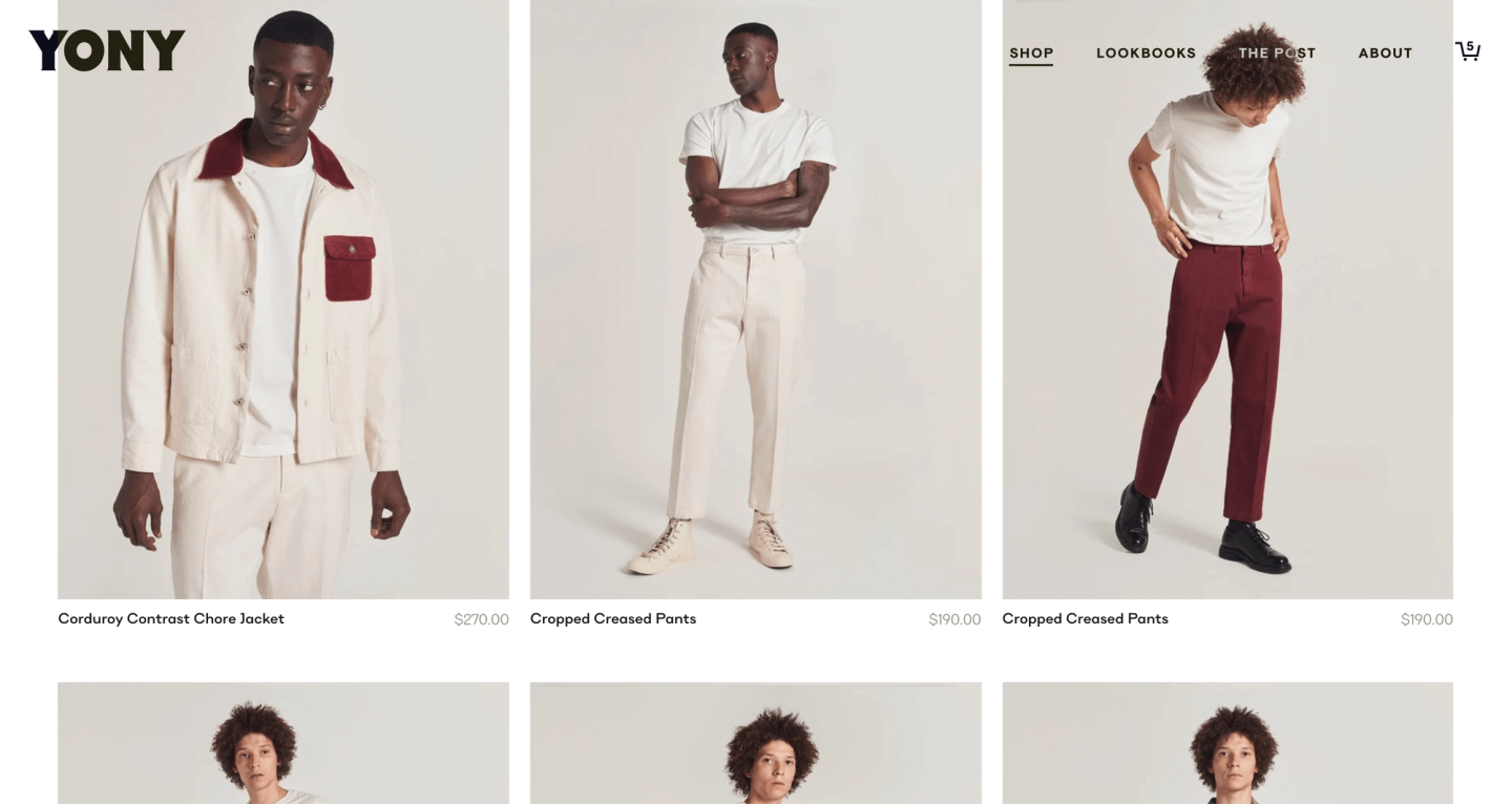
YONY represents a refined take on Americana while placing an emphasis on ethical and thoughtful resourcing of their materials. The e-commerce experience allows the YONY team to call out fabrics and details about where and how specific products were made.
- Shopify
- Gatsby JS
- Headless
Ascend
Ascend’s website was designed and built with an extensive set of flexible modules to fit the charter school’s need to create and update pages often. Soft, fading page transitions and the “e” in the “Ascend” wordmark lifting on hover are the subtle touches that add to the sophistication of the experience. The robust CMS was created using Sanity to tailor the content entry perfectly for the designs.
- Gatsby JS
Before we working together, Ascend's website was unattractive, difficult to navigate, and did not reflect the level of quality we wanted for our brand. They listened to our needs produced a truly beautiful website that is reflective of the incredible education we offer our students. It feels clean, elevated, and unique. We have loved working together!
Hannah Haves